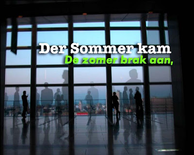
To see the moving image you have to click here.

To see the moving image you have to click here.

To see the moving image you have to click here.

To see the moving image you have to click here.

To see the moving image you have to click here.

To see the moving image you have to click here.

To see the moving image you have to click here.

To see the moving image you have to click here.

To see the moving image you have to click here.

To see the moving image you have to click here.

To see the moving image you have to click here.

To see the moving image you have to click here.
Technorai Tags; motion design, prime on air, typography.


2 comments:
blijft toch een van de betere spullen op canal+/prime van de laatste vier jaar
shit
ik ga in herhaling vallen
blijft echt top
mischien terug leven inblazen
Post a Comment